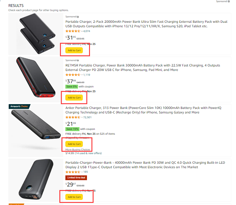
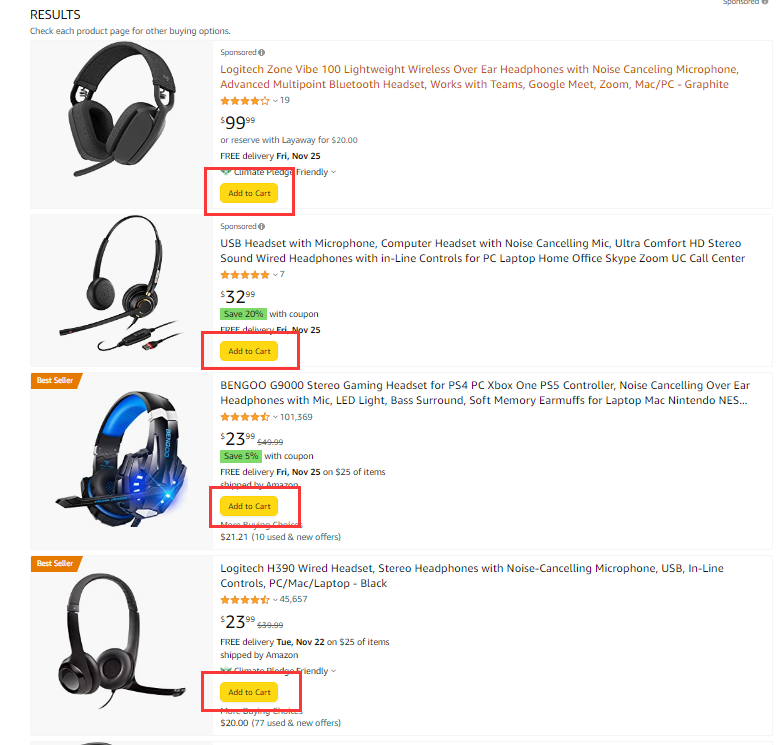
Amazon has recently updated the new search results page display method, adding the "add to cart" button to directly let the seller join the shopping cart, as shown below:


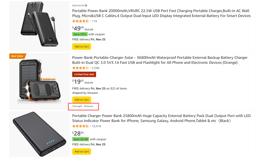
And when we click the "Add to Cart" button, "1 in Cart" will also directly display the "1 in CART" on the search results page to remind the seller that the product has joined the shopping cart. As shown below:

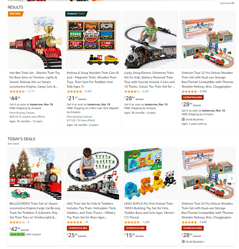
But we also found that not all categories have added this button. If your category search results page is arranged horizontally, there is no such "add to cart" button. As shown below:

So you can check it out, if your products are arranged vertically, see if there is an ADD to cart button display.
It is currently in the test version, and sometimes you may not be able to see such an interface, but it can also explain that the search results page will pay more attention in the future.
Summarize
The purpose of Amazon, we guess it is to improve the transformation. In terms of our experience, the chance of buying after joining the shopping cart is greatly increased than the chance of buying without joining the shopping cart.
What are the instructions for our seller?
This shows that the search results page becomes more important.
In particular, you must optimize your title, picture, star, price and promotional information. Because these are directly displayed on the search results page, which directly affects whether the customer is added to the shopping cart.
Previous:How to operate the brand with a valuation of tens of millions of RMB?
Next:Don't touch these products! A group of seller accounts were frozen